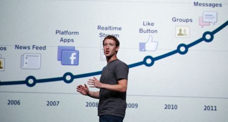
I hate Facebook’s new timeline thingy. Back in the early days, Facebook delivered a clean and light user experience. Its pages loaded straight away and you could scroll up and down the page smoothly within a fraction of a second of its key elements appearing. With the new user interface (UI), the experience is completely different. Whenever you access one of its pages, Facebook now behaves like a newly powered-up Microsoft Windows machine. Even if a Facebook page appears to have fully loaded onto your browser, a bustle of activity continues behind the scenes. Scripts and other applets loading and configuring themselves compete with resources that could’ve been directed to keeping the user happy. In the few seconds while all that is happening, the page jerks up and down the screen while elements load and the scrollbar remains virtually inoperable until things settle down.

[Photo courtesy TechClarify.com.]
Within the period Facebook convulses as it scrambles to load what now looks to be its over-engineered user interface, its users are most at risk of clicking on the wrong element. Items may be “Liked” unintentionally, spam links may be clicked on, “Add Friend” requests may be sent. The potential for personal social catastrophe is unspeakable.
| SUPPORT INDEPENDENT SOCIAL COMMENTARY! Subscribe to our Substack community GRP Insider to receive by email our in-depth free weekly newsletter. Subscribe to our Substack newsletter, GRP Insider! Learn more |
It was really the concept of a news feed that made Facebook and its cousin Twitter so appealing. A one-dimensional linear feed made intuitive sense to the average information-overloaded 21st Century Net warrior. We haven’t really evolved much in the last 5,000 years. We still prefer chronologically-organised narratives where the earlier bit of information precedes the later bit. We read our stories from beginning to end and in plots where there are parallel streams of events, we rely on the skill of the story-teller to organise them to suit our one-dimensional faculties for absorbing narrative.
The irony is in how Facebook’s old “news feed” is now pitched as a “timeline”. It is anything but a line. The new timeline interface forces users — after enduring the first few seconds of visial convulsions following a page request — to scan left to right to left to right as she navigates down said line. Trivial, perhaps, but multiply that little inconvenience by the hundreds of page requests the average user may demand of Facebook per day and you get the aggregate effect: an increased risk of Facebook fatigue.
MySpace suffered a similar fate. The average social networker’s aesthetic taste cannot be trusted. Yet MySpace provided its users a free-for-all platform to render an unfettered “expression” of their individuality so much so that its pages became halls of tackiness. I still recall the exodus to the controlled no-frills environment of Facebook back in the mid 00s. The emphasis was on connecting rather than grandstanding. The change could be likened to the sublime experience of savouring that new car smell for the first time after trading in your 20-year-old clunker.
Clunking along is what can now describe the new Facebook interface. Seems like we are due for the next trade-in soon.
benign0 is the Webmaster of GetRealPhilippines.com.
I’m still one of few standing in front of the horde called ‘timeline’. It plain sucks. It confuses me eyes when it could simply look from top to bottom using the old look.
Yes, classic user interface design conventions dictate that the human eye must not be made to scan web pages horizontally across.
Still, I must be one of the few who likes Timeline.
“Back in the early days, Facebook delivered a clean and light user experience. Its pages loaded straight away and you could scroll up and down the page smoothly within a fraction of a second of its key elements appearing.”
/thirdworldinternetproblems
Apparently Facebook works fine with first world internet speeds (or so my friends in other countries claim).
I agree with the timeline looking very bad though. That’s why I haven’t downgraded my wall to it yet. I dread the day Facebook would force it on my profile and I can’t do anything about it.
That sounds about right.
My non-timeline wall is a total of 471KB. 7secs @ 512kbps.
A randomly-chosen friend’s timeline wall is 1.41MB. 22 22.5secs @ 512kbps.
I’m from Australia and haven’t really compared performance with Philippine Net access speeds. But it’s annoying enough when you compare it to the old FB interface which is pretty much stable as soon as the page appears. Could be also FB is intelligent enough to detect Net access and browser performance as it loads and adjusts accordingly so it compensates a bit for users accessing it from the Philippines…
Actually if I recall it right…Facebook will now automatically upgrade your fb to this timeline just this sept 7 (not quite remember the specific date or something like this). I have never upgraded mine either until this sept 3 logged on (i log on like once every 2 months i started to mostly dislike it) I looked and FB said…better review the look of my FB now because on sep 7 it will upgrade it to timeline. Now I’m totally cheesed off with them. Itimeline is so chaotic
Missing the old layout of Facebook.
Timeline is fugly. But as long as you haven’t clicked that “not now” button, you’re fine until they force it down our throats
C’mon people, its free, if you don’t like it, you can just unsubscribe. As for me, the only use of Facebook to me right now is more like a web-based bookmarking solution, since I read a lot of tech news on the web, and also, my primary chat medium with my family.
Word.
Just read lower left corner of blog.